Thursday, April 28, 2016

One Room Challenge: Week Four

It's hard to believe that we are already going into the last two weeks. Yikes! I feel like everything is going to come together at the very end! I've ordered most of the key pieces and now it's playing the waiting game. The wallpaper installer is coming next week, so no wallpaper to show yet. I booked her as soon as I thought I was going to do this challenge, but she is so in demand that this was the soonest she could do it. I have no experience hanging wallpaper that isn't pre-pasted, so I figured that I would leave that to the professional, especially after the investment in the actual paper! Since there isn't much progress to show in the powder room I thought I would share some fun accessories I've run across. First up towels...
 
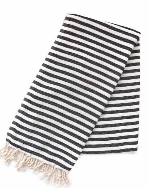
I want to play up the black and white accents with pattern and because there are no window treatments or pillows going in here towels are the next best way. I love the stripes in this natural Turkish towel. I'm trying to decide if I want to go more plush or go with the thinner Turkish. I think a nice stack would look good under the open vanity.
 
 
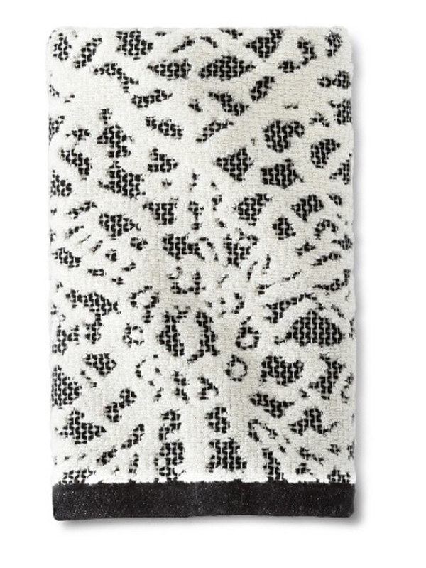
I really like this modern lacework pattern in this target towel. The band at the bottom would also add a nice pop of black!
 
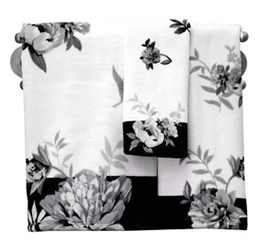
There is something really appealing about this black and white romantic floral set.
 
 
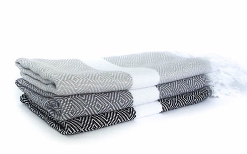
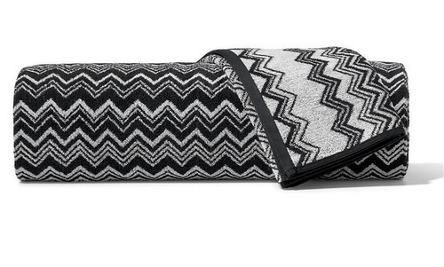
This black and white Missoni towel is a nice option and it looks reversible!


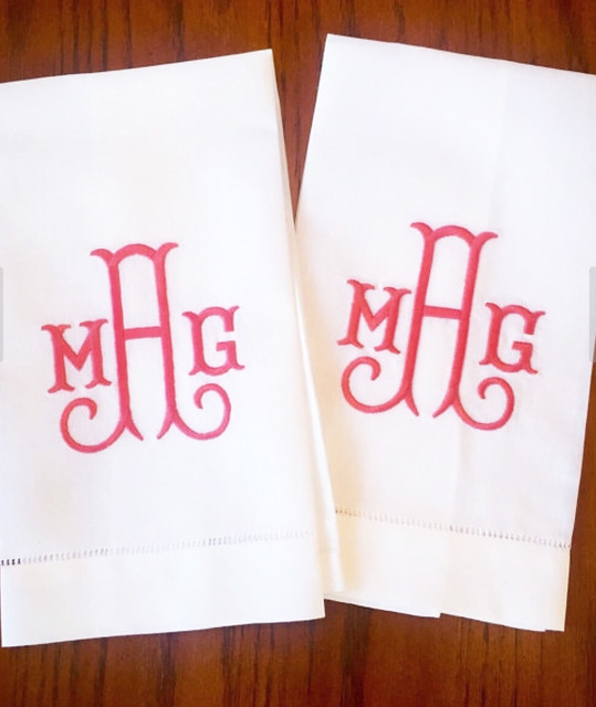
I'm having a pair of these lovelies made and they should be arriving early next week! They will be black and white of course!


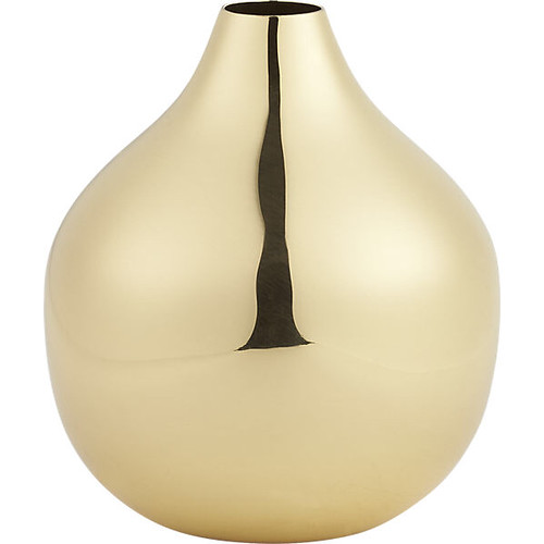
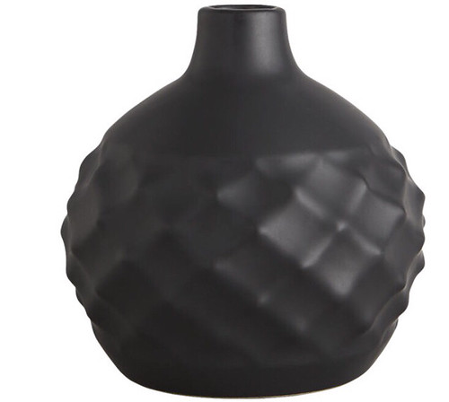
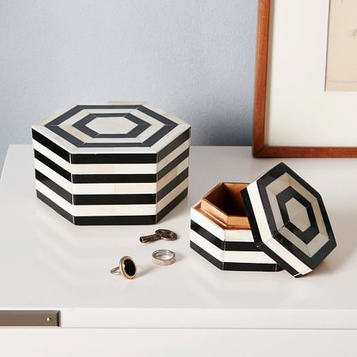
I have also been checking out some cute accesories for the counter. Here are a couple options I found. I think a Target and Homegoods run will be soon!


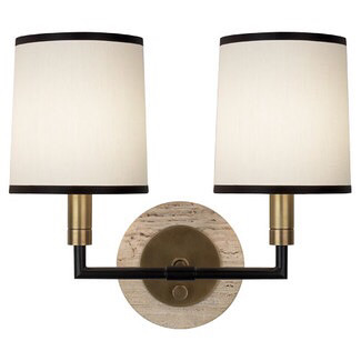
I just found out today that this light fixture is on it's way!


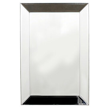
I already have this beauty too!


Things are starting to fall into place, I just need to make some final decisions on accessories. Hopefully I'll have room progress to show next week!
 

Thursday, April 21, 2016

One Room Challenge: Week Three

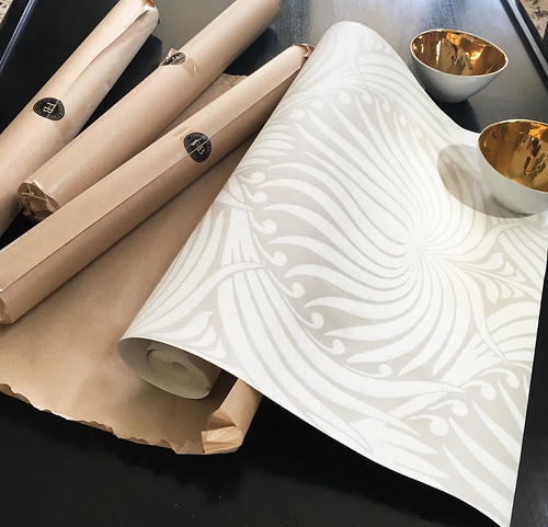
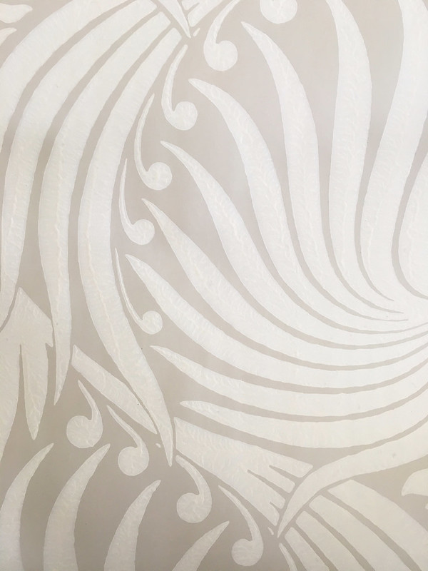
So, not a lot has actually happened in the powder room itself, but look what arrived! So excited to get this put up. It's really beautiful in person!
 
 
I took a close-up of the paper to show all of the wonderful printed texture that comes through.


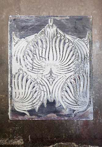
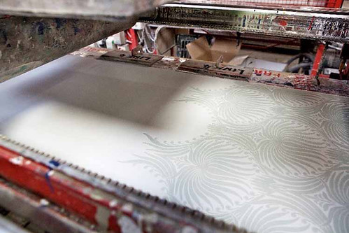
Here is an explanation of how they get that wonderful texture and how they are printed directly from the Farrow and Ball website:

Wallpapers are generally made using ink. Not ours. Determined to follow in our founder’s footsteps, we use traditional block and trough printing methods as well as our own richly pigmented paint, to give each design a sumptuous and tactile texture, unique to Farrow & Ball.

The chosen paint is applied to the etched surface of the block through a trough and roller, and the block is then carefully pressed onto the paper, like a stamp.


I also love that these papers are eco-friendly.
More from their site...

Our wallpapers are created using our eco friendly water based paints and paper sourced only from FSC® accredited.


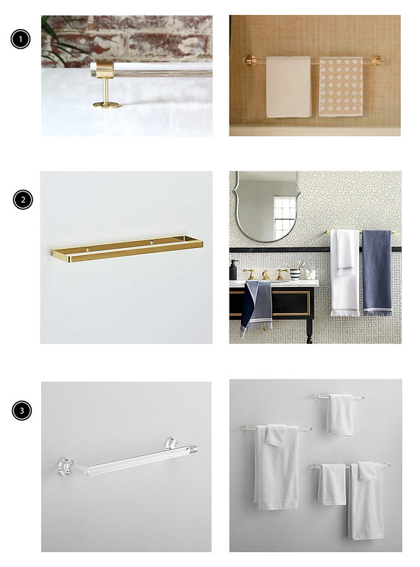
I've also been researching a lot of bathroom fixtures. All lucite and brass of course! I thought I would share some of the great finds I've come across...

 
1. Lux Holdups - So beautiful these lucite towel bars are my top choice
2. CB2 - Love the modern design of this brass towel bar (there's also a TP holder)
3. CB2 - This acrylic towel bar is a great option that is more affordable than the lucite and brass.


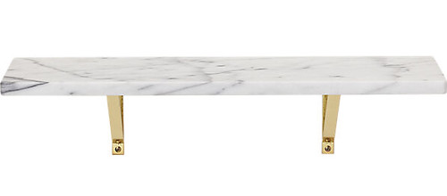
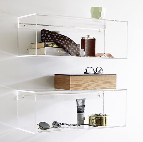
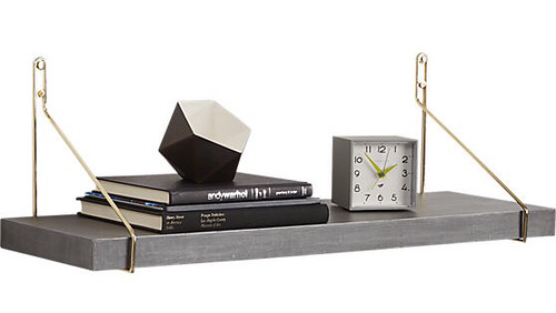
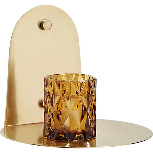
While I was exploring the towel racks on CB2 I came across some great shelf options. I'm thinking my powder room might need a shelf.
 
Love this marble and brass shelf option. This might be my top contender. It's very similar to some others I found, but at a great price!


I kind of like the idea of the acrylic shelf so that the wallpaper still shines through.
 
 
I like the wood and brass combo of this little shelf.


I think this could be fun to do a grouping of floating brass shelf I need to decide where I'm going with these quickly and get them ordered fast!


Thursday, April 14, 2016

One Room Challenge: Week Two

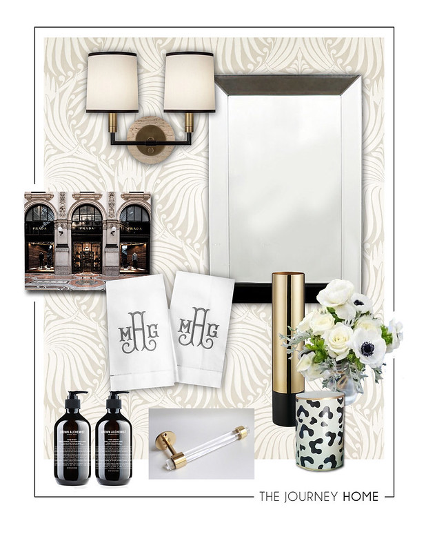
Today I'm sharing my design plan for our powder room, or at least the plan for now! So, here it is...
 
This powder room is going to be a nice mix of traditional and modern elements, which is kind of how we roll style-wise. The wallpaper I have selected is Farrow & Ball in the Lotus pattern. I went with the lightest color combination BP2007, which looks like a very light taupe with off-white. With the big scale in such a small space I really felt like it would be better to go with a colorway that didn't have too much contrast. I'm so excited to get this put up. It is scheduled to arrive tomorrow! I also want to do accents and accessories in black, gold and lucite...I love this stunning combo! I will share some more details soon.
Go check out the rest of the awesome ORC participants at Calling it Home!


Wednesday, April 6, 2016

One Room Challenge: Week One

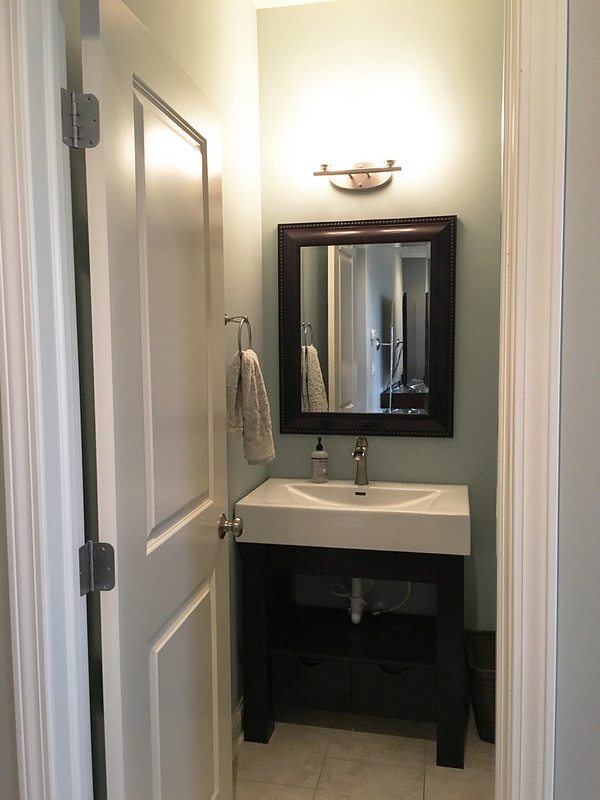
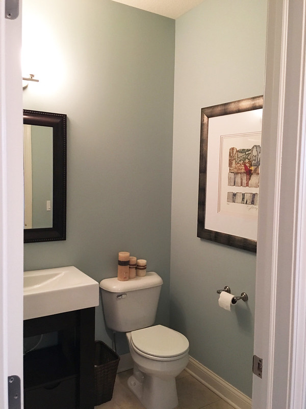
Well, here we go...my very first One Room Challenge! I've been following the ORC for many years, and now I'm finally going to participate. This awesome challenge is hosted by Linda from Calling it Home. For those that are new to the ORC, it goes like this...20 designers are selected to participate in a challenge to transform a room in six weeks. Each Wednesday they blog about their progress and Thursday's are open to any guest participants, like me! I kind of decided late in the game so I'm a little nervous about getting everything done in time, but very excited to be a part of this super supportive community. I thought for my first ORC that I would start off small, so the room I will be doing is our downstairs powder room.
 

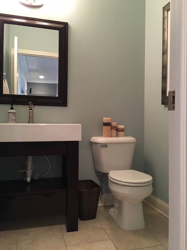
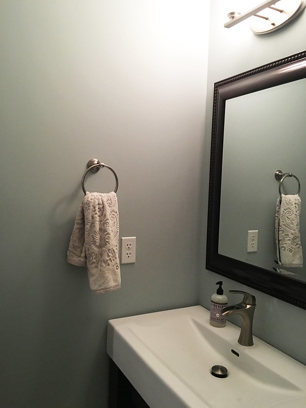
While the room is just fine, there is nothing really special about it. I've been wanting to add wallpaper somewhere in our house and now I have the perfect excuse to finally do it! I also want to replace fixtures, update our mirror and zhush it up with pretty accessories.


We had previously updated the sink and vanity so that will be staying. I also want to do something on the wall above the toilet, but I haven't quite figured out what direction I'm going in. I guess that's part of the fun!


The powder room is fairly small, but with high ceilings. I think the wallpaper will add some great visual interest and help fill that space.
 
 
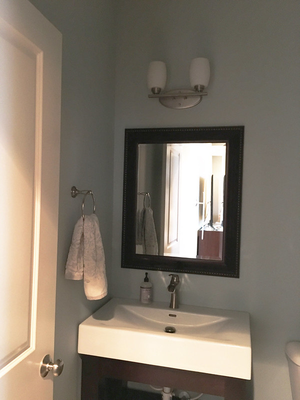
One last picture with the lights off to show the light fixture that will soon be gone.
 
 
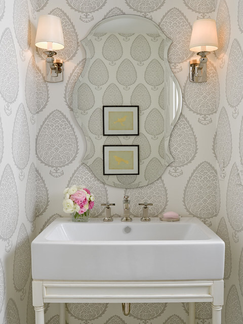
I'm not quite ready to reveal my full design plan, but definitely wanted to share some inspiration photos so you can get an idea of the direction I will be going in.


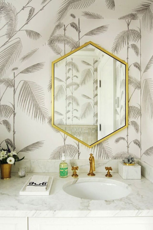
I love the idea of an oversized pattern, but in a more subtle neutral color way. Being a designer I love color, but in my spaces at home I'm a neutral girl through and through.


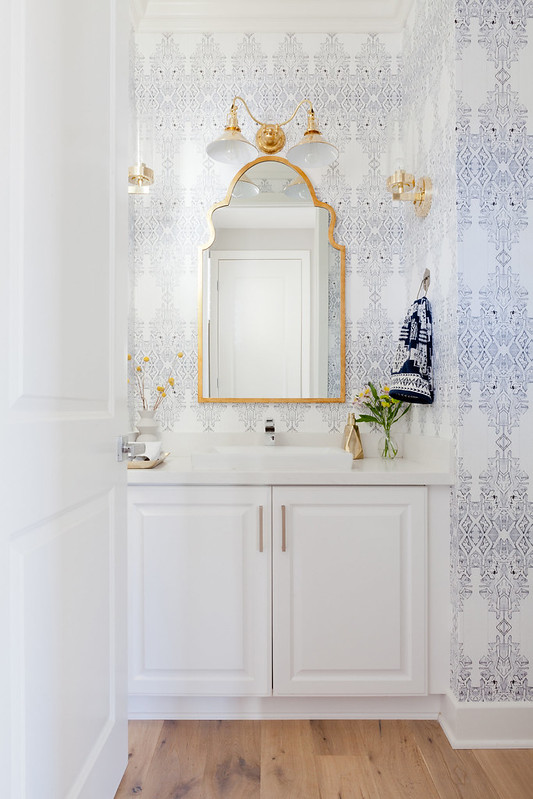
This space is divine! I just love the wallpaper pattern with the gold accents. I'm still trying to decide if I'm going to keep mine all silver or go for mixed metals and add in gold/brass accents...decisions, decisions!
 

Source: the Zhush
 
I love this guest bath designed by Sue from the Zhush for the last ORC. She always designs beautiful spaces! I'm excited to see what she will be doing this time.
 
 
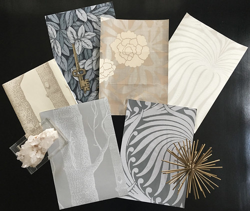
I thought I would leave you with a peek of the patterns and colorways that were in the running for the wallpaper. I just love getting all of the pretty paper samples! Makes me want to put wallpaper all around the house...I might have a slight problem...
 
 
Well, I hope to see you next Thursday where I will reveal my full design plan and some of the items I have chosen. I better go and get to work!
You can also follow me on Instagram!